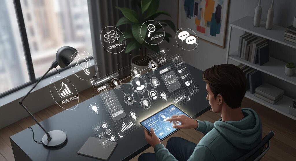
In 2026, to succeed in email warmup, you must pay close attention to your email deliverability. Email warmup involves gradually increasing the volume of emails sent to build a solid reputation with email service providers. This process remains simple if you adopt a structured method tailored to your business. Magileads offers a software solution that automates each step and secures your sending strategy.
Key points for a successful email warmup
- Successfully warming up your email campaign is essential for building a solid reputation with internet service providers. Start by sending emails gradually to avoid being marked as spam.
Authenticate your domain with SPF, DKIM, and DMARC. Good authentication improves your email deliverability and helps you succeed with email warmup.
Build a list of engaged contacts. Prioritize subscribers who interact with your emails to strengthen your reputation.
Regularly monitor key indicators such as open rate and bounce rate. Adjust your strategy based on the results to maintain good deliverability.
Use tools like Magileads to automate the warmup process. This saves you time and helps you avoid technical errors.
Why mastering the email warmup is essential
The challenges of deliverability today
Email deliverability is a major challenge for any business that wants to succeed with its marketing campaigns in 2026. You need to monitor several aspects to ensure your messages reach your recipients' inboxes. Today, email service providers analyze your domain reputation, the quality of your contact database, and user interaction with your emails.
The sender's reputation directly influences the placement of your messages. If you neglect this reputation, your emails risk being marked as spam.
A high bounce rate, caused by incorrect or inactive addresses, damages your credibility.
Behavioral signals, such as opens, clicks, or unsubscribes, play a key role in the perception of anti-spam filters.
You must also comply with new legislation on consent and accessibility, while maintaining an technical infrastructure (authentication, domain consistency).
The 2026 survey shows that the majority of businesses struggle to avoid spam and keep their contact lists up to date. Investing in your industry's reputation is becoming just as important as cultivating your brand image.
Case Studies: The Risks of Poor Management
Illustrating importance through failure is a powerful persuasion technique.
Case #1: The “Sudden Death” of a New Domain
A SaaS start-up launched a cold email campaign with a brand new domain without a warm-up period.
As a result, after 200 emails were sent on the first day, the domain was blacklisted by Spamhaus.
Result: Not only were sales emails no longer being delivered, but transactional emails (order confirmations, password resets) were also blocked. Estimated loss: €15,000 in revenue in one week.
Case #2: The Impact on Marketing ROI
An e-commerce company neglected its warmup after changing its sending platform (ESP).
As a result, the open rate fell from 35% to 8% in one month.
Solution: Stopping the campaigns and a forced 4-week warmup procedure were necessary to stabilize the reputation.
Words from Digital Marketing Experts
“In 2026, sending emails without a warm-up is like trying to run a marathon without warming up: you’ll injure (your domain) before you even reach kilometer 5.” — Neil Patel, Founder of NP Digital.
“Successfully warming up emails is no longer a ‘hacker’s trick’; it’s become the standard protocol. If you don’t simulate or generate positive interactions from the start, Google Workspace’s AI filters will classify you as a malicious bot.” — HubSpot Expert, The State of Generative AI in Email Marketing
Best Practices for a Successful Email Warmup
To maintain a stellar reputation, rely on official recommendations:
Full Authentication (SPF, DKIM, DMARC): Now mandatory for all senders (see Postmark guides ).
Positive Engagement: Don't just send; to succeed in email warmup it must include responses and "Not Spam" markings by recipients.
Easy Unsubscription: In 2024-2026, the absence of a one-click unsubscribe link instantly degrades the deliverability score.
Risks without warmup mail
Ignoring the email warmup phase exposes your business to real risks. Sending a mass email without preparation triggers alerts from email providers. Your emails can then be classified as spam or, worse, your address can be blocked.
Unprepared emails often end up in the spam folder.
A poorly executed warmup reduces deliverability and can permanently damage your sender reputation.
A misconfigured SPF record can sometimes block 100% of your messages.
Spam complaints and high bounce rates result in immediate penalties.
To avoid these obstacles, you need to adopt a progressive and structured strategy. Successfully completing email warm-up allows you to build a solid reputation, improve your domain's credibility, and ensure the success of your campaigns.
Prepare to succeed in the email warmup
Domain authentication (SPF, DKIM, DMARC)
You must start by securing your domain. Authentication protocols play a fundamental role in ensuring the deliverability of your emails. In 2026, the recommended standards include:
SPF (Sender Policy Framework) : This protocol verifies that your emails come from authorized IP addresses.
DKIM (DomainKeys Identified Mail) : This method confirms that the email does indeed come from your domain.
DMARC (Domain-based Message Authentication Reporting and Conformance) : This system protects against identity theft and phishing.
To succeed in email warmup, a properly authenticated domain displays an average deliverability rate above 90% if your sender score exceeds 90.
Sender score | Average deliverability rate |
|---|---|
> 90 | 91% |
81 – 90 | 71% |
0 – 80 | 50% of emails are rejected |
Forming a committed list
The quality of your contact list directly influences the success of your email warmup. You should prioritize your most engaged subscribers. An engaged list demonstrates a high level of interaction to email service providers, which improves your sender reputation. Contacts from detailed forms open emails at a rate of over 40%. Fewer, but more qualified, contacts guarantee better open and conversion rates.
Implement a double opt-in to strengthen the quality of your database.
Avoid sensitive terms that trigger spam filters.
Selection of suitable tools
To succeed with your email warmup, you need to choose a reliable and efficient tool. The most popular solutions in 2026 include:
TrulyInbox
Warmy.io
Mailreach
MailFlow
Warm Up Your Email
Saleshandy
A good email warmup tool should improve deliverability, be compatible with major email providers, manage warmups in multiple languages, offer email health checks, and automate the process. Some tools, like Magileads, use artificial intelligence to secure your mailings and boost your sender reputation.
Tip for successful email warmup: Start by sending 10 cold emails per day, then gradually increase the volume. Monitor interactions to adjust your strategy and ensure optimal deliverability.
Planning for a successful warmup email
progressive calendar
To successfully warm up your email, you need to follow a precise and progressive schedule. This planning allows you to build a solid reputation with internet service providers and avoid blocks. Here's an example of a recommended schedule for 2026 :
Day 1 : Send 10 emails to your most engaged contacts. This first step lays the foundation for your reputation.
Day 2 : Increase to 15 emails. Observe the initial responses and monitor for any bounces.
Day 3 : Increase to 20 emails. Continue to target the contacts who interact most with your messages.
Day 4 : Reach 25 emails. Maintain the quality of your list and analyze open rates.
Days 7-8 : Gradually increase to 40-45 emails per day. This increase should remain natural.
Last week : Aim for 100 emails per day, keeping an eye on deliverability and engagement.
Tip: Always start with the most responsive contacts. Their positive engagement strengthens your domain's reputation from the very first days.
Adjust this schedule based on your results. If you see an increase in bounces or a decrease in open rates, slow down and clean up your list. Flexibility remains essential to preserving your sender reputation.
Here is a comparative table based on average performance data observed by deliverability platforms (such as Magileads, Instantly or Mailreach) in 2026.
This table illustrates the critical impact of a strategy for successfully warming up email on a new domain or IP address
Performance Metric | "Cold" zone (Without Warmup) | Heated area (with warmup) | Impact on Business |
Deliverability rate | 15% – 30% (Mostly spam) | 95% – 99% (Main box) | Crucial for ROI |
Open Rate | < 10% | 45% – 70% | Visibility of the offer |
Reputation of the Domain | “Neutral” to “Suspense” | “Committed” (Positive) | Sustainability of the estate |
Risk of Blacklisting | Raised (Spamhaus, Barracuda) | Very Low | Technical security |
Authorized sending volume | Blocked by ISPs if > 50/day | Progressive (200+ /day without risk) | Scalability |
Google/Outlook Placement | Tab “Promotions” or “Spam” | Main Inbox | Response rate |
Data analysis to succeed in the email warmup
Gmail's "Sandboxing": In 2026, Google's algorithms systematically place new domains in an observation phase called Sandboxing. Without active warmup, 80% of the first emails are filtered to test user reaction.
👉 Source: Google Senders Guidelines 2024/2026
The importance of the Send/Response ratio: For AI filters, a domain that sends 100 emails and receives 0 replies is considered a spammer. Successfully warming up your emails allows you to simulate a response rate of 25-30%, which reassures receiving servers.
👉 Source: Mailgun case study on sender reputation
Customer Acquisition Cost (CAC): Poor deliverability increases CAC by nearly 300% because you are paying for tools and databases that no one sees.
Contact segmentation
Segmentation plays a key role in successful email warm-up. By dividing your database into homogeneous groups, you improve deliverability and target your recipients more effectively. Here's why you should segment your contacts:
Segmentation improves email deliverability by limiting mailings to inactive or low-engagement addresses.
Targeting specific groups increases open and click-through rates.
You can segment according to demographic criteria (age, sector, location) or behavioral criteria (open rate, recent interactions).
To enhance the natural effect of your emails and ensure a successful email warmup, adopt a sending template that mimics human behavior:
Use a dedicated domain or subdomain for prospecting.
Properly authenticate your domain with SPF, DKIM and DMARC.
Perform a gradual warm-up of the domain, avoiding sudden volume spikes.
Regularly clean your list by removing addresses that bounce.
Vary the pace and length of your messages to avoid repetitive patterns.
Avoid spam-type words in the subject and body of your emails.
Tip for a successful email warmup: Analyze the performance of each segment. If a group has a high bounce rate, temporarily remove it from the email warmup and focus on the most active segments.
By adjusting the pace and segmentation based on results, you maximize your chances of reaching the inbox and build a lasting reputation. Rigorous planning and continuous adaptation remain the keys to successful email warm-up.
Key steps to a successful email warmup

Slow start
To successfully warm up your email campaign, you should always begin with a slow start. This step helps lay the foundation for a positive reputation with your email service providers. From day one, you should verify and optimize your technical setup: SPF, DKIM, and DMARC must be operational. Then, send a small volume of emails, only to your most engaged contacts. This approach minimizes bounce rates and maximizes the chances of positive interaction.
Tip for a successful email warmup: Create authentic interactions from the start. Reply to some emails, mark them as important, and encourage your contacts to engage with your messages.
Here is an example of a progression for the first week:
Days 1 to 3: 10 to 15 emails per day.
Days 4 to 7: 15 to 20 emails per day.
This gradual ramp-up allows you to monitor initial feedback and quickly adjust your strategy if necessary.
Gradual increase
After the first week, you can gradually increase the sending volume. The goal remains to build a solid reputation without triggering spam filters. You must continue to target the most active segments and monitor the reactions of your subscriber base.
A typical salary increase schedule might look like this:
Week | Recommended daily sending volume |
|---|---|
Week 1 | 10-20 |
Week 2 | 30-50 |
Week 3 | 70-100 |
Week 4 | |
Week 5 | 150 |
Week 6 | 250 |
At each stage, you need to monitor open and bounce rates. If you notice a drop in engagement or an increase in spam complaints, slow down and clean up your list.
Tip: Aim for an open rate above 25% to validate each milestone before increasing the volume.
Performance tracking
Performance tracking is the cornerstone of a successful email warmup. You need to monitor several metrics daily to ensure your emails are reaching the inbox.
Key indicators to monitor:
Open rate
Click-through rate
Bounce rate
Spam complaint rate
Overall engagement rate
The inbox placement rate remains the most important metric. It tells you if your emails are actually reaching your recipients. A low open or click-through rate can indicate a deliverability problem or irrelevant content.
To help you with this monitoring, several tools are available:
Instantly.ai : ideal for managing multiple boxes and tracking progress.
Mailreach.co: suitable for sales teams with simple tracking.
Email Deliverability Tester: useful for testing deliverability for free.
Sendinblue: known for its IP management and spammer detection.
Note: Analyze each metric after every send. A good deliverability rate shows that your strategy is working, while a high bounce rate should alert you to the quality of your database.
By following these key steps, you build a reputation as a reliable sender and maximize the results of your future campaigns.
Magileads Email Preheating Strategy
Main features
Magileads offers a complete solution to automate every step of your email warmup. You'll benefit from a tool designed to simplify management and protect your sender reputation. From the very first use, you'll discover a clear interface and features designed to support you at every stage.
Gradually build your sender reputation through gradual mailings.
Centralized management of email warm-up directly within the prospecting automation tool.
Real-time deliverability tracking with intuitive dashboards.
Automatic alerts in case of a problem detected on your campaign.
Personalized recommendations to optimize each step of the process.
You save time and avoid technical errors. Magileads helps you build trusting relationships with internet service providers while maintaining control over your campaigns.
Benefits for deliverability
With Magileads, you can significantly improve your email deliverability. The tool helps you maintain an up-to-date contact database, reducing the risk of bounces. You use a professional domain name to strengthen your credibility with recipients. Magileads guides you to avoid spam trigger words in your messages and to respect your users' sending frequency preferences.
You're seeing a clear decrease in rejected emails.
Your messages are arriving in your main inbox more often.
You will receive personalized support for each step of the warmup email.
Thanks to the security and simplicity of Magileads, you build a solid reputation and ensure the long-term success of your campaigns.
Monitor and optimize for a successful email warmup

Indicators to monitor for a successful email warmup
To ensure the success of your email warmup strategy, you need to monitor several key indicators. This data allows you to anticipate problems and quickly adjust your approach. Here are the main indicators to track:
Open rate : This figure shows how many recipients actually open your emails. A high rate indicates that your messages are relevant to your target audience and that your reputation is improving.
Bounce rate : Bounces indicate invalid or inactive email addresses. A low bounce rate demonstrates the quality of your contact database.
Spam complaints : If recipients report your emails as spam, you must react quickly. A high complaint rate damages your sender reputation.
Inbox placement or spam folder : Analyze where your emails land. Good inbox placement remains a sign of an effective strategy.
Tip: Use a dashboard to view these indicators in real time and detect any anomalies as soon as they appear.
Real-time adjustments
You need to remain responsive throughout to succeed with email warmup. Best practices include continuously monitoring your campaign performance and using analytics tools to gain precise insights. Here's how to optimize your strategy:
Monitor deliverability, open, click and unsubscribe rates daily.
Uses analytical dashboards to quickly identify trends and anomalies.
Identifies problems without delay, such as a high bounce rate or an increase in spam complaints.
Immediately adjust the sending volume or segmentation if you observe a drop in performance.
Don't hesitate to slow down or clean up your list if you detect a problem. This responsiveness protects your reputation and ensures the success of your warmup.
Mistakes to avoid to succeed in the email warmup
Mass shipments too early
You absolutely must avoid sending a large number of emails at the very beginning of your email warmup. Internet service providers closely monitor sending volumes. If you increase them too quickly, you risk triggering spam filters and seeing your sender reputation plummet. A gradual start remains the best strategy for building a solid reputation.
Practice a gradual warm-up by increasing the volume of the shot step by step.
Use a dedicated IP address to control your reputation and limit the risks associated with other senders.
Pay attention to the sender's name. A recognizable name reassures recipients and improves deliverability.
💡 Tip for successful email warm-up: Always test your messages before each mass mailing. This allows you to check the quality and relevance of your emails, while anticipating potential deliverability issues.
Poor quality base
The quality of your contact list directly influences the success of your warmup campaign. A list containing inactive or incorrect addresses leads to high bounce rates. Internet service providers then consider your emails suspicious.
Clean your database regularly to remove invalid addresses.
Prioritize engaged contacts who open and interact with your emails.
Implement a double opt-in to guarantee the authenticity of the registrations.
🚩 Warning: Using a dynamic IP address can harm your sender reputation. Opt for a dedicated IP and monitor your database health to avoid penalties.
By avoiding these common mistakes, you ensure the success of your email warmup strategy and protect your domain's reputation in the long term.
Maintaining reputation after the email warmup
Best practices for sending
After successfully completing the warm-up phase, you need to adopt solid habits to maintain your sender reputation. Every send counts. Here are the essential practices to follow:
Maintain a regular sending schedule : Avoid sudden volume spikes. Plan your campaigns to keep a stable frequency.
Maintain the quality of your lists : Regularly update your contact database. Remove inactive addresses or those that bounce.
Personalize your messages : Address each recipient by their first name. Offer relevant content tailored to their expectations.
Respect your subscribers' preferences : Always offer an easy way to unsubscribe. Take into account the feedback and requests from your contacts.
Test your emails before sending : Use tools to check deliverability and detect spam trigger words.
💡 Tip for successful email warmup: Quality content and appropriate frequency strengthen the trust of access providers and your recipients.
continuous monitoring
Maintaining a good reputation requires constant vigilance. You must monitor key indicators and react quickly to any anomalies.
Indicator | Threshold to monitor | Recommended action |
|---|---|---|
Bounce rate | < 2 % | Clean your base |
Complaints about spam | < 0,1 % | Analyze the content, adjust the sending |
Open rate | > 20 % | Optimizes the object and the content |
Unsubscribe | < 1 % | Re-evaluate the relevance of the messages |
Configure automatic alerts to detect any performance drops.
Analyze deliverability reports after each campaign.
Adjust your strategy as soon as you observe a negative trend.
🚦 Stay proactive: regular monitoring allows you to anticipate problems and preserve the health of your domain in the long term.
To ensure the success of your email warmup, you need to follow a structured method: prepare your domain, build an engaged list, plan each step, and monitor your metrics. Use Magileads to automate and secure the process.
Adopt a regular sending routine.
Analyze performance after each campaign.
Regularity and monitoring guarantee optimal deliverability in the long term.
FAQ for a successful email warmup
How can I tell if my warmup email is working correctly?
Monitor open, bounce, and inbox placement rates. If you see positive growth and few spam complaints, your strategy is working. Use a dashboard to track these metrics in real time.
How long does the warmup phase last?
The duration varies depending on the size of your database and the reputation of your domain. Generally, allow between 2 and 6 weeks for an effective warmup. Pay close attention to the results to adjust the pace if necessary.
Can I use Magileads with any email provider?
Yes, Magileads integrates with most business email providers. You can connect your existing solution and automate the warmup without changing your infrastructure.
What should I do if my bounce rate suddenly increases?
Clean up your contact list immediately. Delete invalid or inactive addresses. Analyze the source of new contacts to avoid adding low-quality email addresses.
Should I continue the warm-up after reaching my target volume?
You must maintain good sending practices even after the warm-up. Continue to monitor your metrics and adjust the frequency to preserve your sender reputation in the long term.
See also
Essential Strategies to Optimize Your Prospecting Campaigns
Top 10 Email Marketing Tools for Effective Prospecting
Guide to Setting Up a Free Email Address in 2025
Tips to Improve Your Cold-Mailing Campaigns
Instructions for Designing a Free and Effective Email Signature