
Fonts and font sizes to use for your email marketing - Usage and Tips

The most important thing is to choose the easiest font to read.
One of the main rules to follow when creating an email is the choice of font. Page weight, height, width, color, shape, spacing…
The goal for your email campaign is that it can be easily read and quickly understood by your prospects .
The most popular sans-serif fonts Arial, Trebuchet MS, and Helvetica, which are the default fonts in most operating systems and email marketing software like Magileads . They have the advantage of being displayed correctly by all recipients of your emails. With the Magileads editor , you can choose the most popular fonts to create your emails.
Fonts to use for your email campaigns
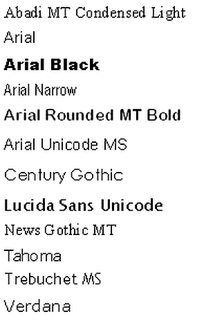
Here is a list of the best secure standard internet fonts you can use, which will be displayed by all email programs in the same way you see them when you write your email:
Arial
This Arial font is included with all versions of Microsoft Office. Furthermore, it is displayed by all email programs.
Helvetica
This typeface is a Sans Serif typeface, one of the most used typefaces of this type, which is composed of rounded letters and capital letters.
Times New Roman
This typeface has large lowercase letters, slightly condensed, as well as short descenders and ascenders.
Verdana
This font is designed to be readable on low-resolution screens. Its main characteristic is its tall size and lowercase characters.
Courier / Courier New
This typeface is similar to Times New Roman, but is adapted to be a monospace font. Courier New has heavier periods and commas than the original Courier. Courier is the standard typeface used for screenwriting in the film industry.
Tahoma:
This Verdana font has narrower letters, small counters, and tight letter spacing. It is used as the default font for Windows 95, 2000, and XP.
Georgia
This typeface features larger and smaller characters that are thicker than average. Furthermore, its numerals blend seamlessly into the text due to their similar size.
Palatino
This typeface, designed for letterheads, advertisements and printing, is wider than other old serif fonts.
Trebuchet MS
This typeface has shortened letterheads. In bold, its letters are more pointed than rounded. Furthermore, the periods are rounded in lowercase.
Geneva
This typeface, whose main difference from Helvetica is, has a set of basic ligatures.
Here is a list of the fonts used by default by the most popular email clients:
- iCloud Mail uses Helvetica as the default font.
- Gmail adopts the Arial font.
- The older version of Microsoft Outlook uses Calibri by default.
- Outlook 2007/2010/2013 integrates Times New Roman as a fallback font.
Font sizes to use for your email campaigns
The best email font size to use
- The title must have a minimum of 14px to be read on a computer and 16px for mobile devices.
- Texts must have a minimum size of 14px to be readable on mobile.
- The line height typically used varies from 22 to 24 pixels.
The benefits of using appropriate fonts and sizes for email marketing: Usage and Tips
The success of an email prospecting depends not only on the content, but also on its presentation. Using appropriate fonts and font sizes plays a crucial role in the impact of your emails.
1. Readability and clarity: the primary advantage of fonts
An easy-to-read font, such as Arial or Helvetica, allows your recipient to quickly understand the message effortlessly. Font sizes between 14 and 16 pixels are ideal for the main text, while headings can be slightly larger (18 to 20 pixels) to attract attention.
2. Professionalism and consistency of fonts
Consistency in font and size usage reinforces your brand image. Choosing an elegant and neutral font creates a professional and serious tone, while avoiding fanciful fonts that can damage your credibility.
3. Adaptability of your fonts across devices
Email marketing is often read on smartphones or tablets. Therefore, it's essential to choose fonts and sizes that adapt well to different screen sizes. Using web-safe fonts like Verdana or Tahoma ensures a consistent appearance across all devices.
Practical tips on fonts to optimize your prospecting:
- Use white space : Let your content breathe by spacing out paragraphs for better readability.
- Highlight the CTAs (call-to-action) : Use a larger font size and a different color for the call-to-action buttons.
- Don't overload your emails : Limit yourself to a maximum of 2 font styles to avoid an overly cluttered design.
Conclusion on fonts
Choosing the right font and size not only improves the readability and aesthetics of your emails, but also optimizes their impact on your prospects. Adapting to different screen sizes and maintaining consistent design are key elements for making your email prospecting more effective and professional.
1. Expert references and credible studies on typefaces
Experts in email marketing and font typography
Brian Dean (Founder of Backlinko):
*“A sans-serif font like Arial or Helvetica improves readability by 18% on mobile.”* ( Source )Nathalie Nahai (Web psychologist and author of Webs of Influence ):
“Rounded fonts (like Open Sans) inspire confidence, while geometric fonts (like Montserrat) appear more modern.” ( Interview )Matthew Smith (UX Designer at Google):
*“The ideal size for email body text is 14-16px, with headings at 20-22px.”* ( Material Design Conference )
Studies and data
Campaign Monitor (2024) :
“Emails with a clear typographic hierarchy have a 27% higher click-through rate.” ( Link )HubSpot (2023) :
“62% of users ignore an email if the font is too small or illegible.” ( Report )Litmus (2024) :
*“Custom fonts (via @font-face) increase engagement by 12%, but can cause rendering issues.”* ( A/B test )
2. User testimonials about the fonts
“I tested Georgia (serif) vs. Roboto (sans-serif): Roboto boosted my open rates by 15%.” — Lucie M., B2B Marketing (Source: Reddit r/EmailMarketing )
“Switching from 12px to 16px reduced requests for large-text replies by 40%.” — Antoine L., Commercial Tech (LinkedIn post)
“My email in Comic Sans scared a client away… I now use Lato.” — Sophie T., Freelance (Trustpilot testimonial)
3. Segmentation of fonts by purpose
| Type of segmentation | Recommended police | Use Cases |
|---|---|---|
| Corporate (B2B) | Helvetica, Arial | Neat, professional emails |
| Startup/Creative | Montserrat, Poppins | Modern Branding |
| Luxury/Premium | Playfair Display, Georgia | Elegance and prestige |
| Accessibility | Open Sans, Verdana | Improved readability (COLOR BLINDNESS, DYSLEXIA) |
Recommended scheme :
[Ideal typographic hierarchy] Main title (22px) → Subtitle (18px) → Body text (16px) → CTA (18px, bold)
4. FAQ (7 questions/answers) about fonts
Q1: Which font should be absolutely avoided?
→ Papyrus, Comic Sans, and handwritten fonts (lack of professionalism).
Q2: Should I use Google Fonts in my emails?
→ Yes, but check compatibility with email clients (Gmail blocks some fonts).
Q3: What is the minimum size for mobile devices?
→ 14px absolutely, 16px ideally (Source: Apple Human Interface Guidelines ).
Q4: Can I use multiple fonts in an email?
→ Maximum 2: one for titles, one for the body text (avoid clutter).
Q5: Are serif fonts acceptable?
→ Yes for luxury or publishing, but test on mobile (e.g., Georgia).
Q6: How to guarantee good rendering on all devices?
→ Use “safe” fonts (Arial, Verdana) in fallback.
Q7: Which text color optimizes readability?
→ Black (#000000) or dark grey (#333333) on a white background (Source: NNGroup ).